Trends That Photograph Beautifully but Feel Wrong in Real Life
Some design trends photograph brilliantly and feel wrong to live with. Understanding why that gap exists changes how you evaluate choices before making them.
The standard advice on the all-white kitchen is that it photographs like a dream and requires either superhuman maintenance or the willingness to live in a space that no longer looks like the photo within six months of normal use. For a renting professional without a professional cleaning schedule, that advice is correct, and the kitchen renovation that made it look exactly like the photo costs real money to maintain at photographic standards.
Interior design content lives in images. The things that make a space photograph well and the things that make it comfortable to inhabit overlap in some areas and diverge sharply in others. The overlap is real—good light is good light whether you're photographing a room or eating breakfast in it. But the divergence is systematic and underdiscussed, which is why a specific set of trends has a long history of looking brilliant in content and feeling wrong at 7 PM on a Tuesday when the novelty has worn off.
The tension is structural: the economy of home design content rewards visual distinctiveness, and visual distinctiveness is often achieved by choices that sacrifice livability for impact.
What Photography Rewards That Living Punishes
Hard surfaces everywhere. Stone-tiled floors in living spaces, marble countertops in kitchens without mats, concrete-look finishes through an entire room—these create powerful visual coherence in a photograph and acoustic discomfort in daily life. Hard surfaces amplify reverb, create thermal cold, and produce a fatigue-inducing visual intensity that natural light and a camera sensor process very differently from the human nervous system over an extended evening.
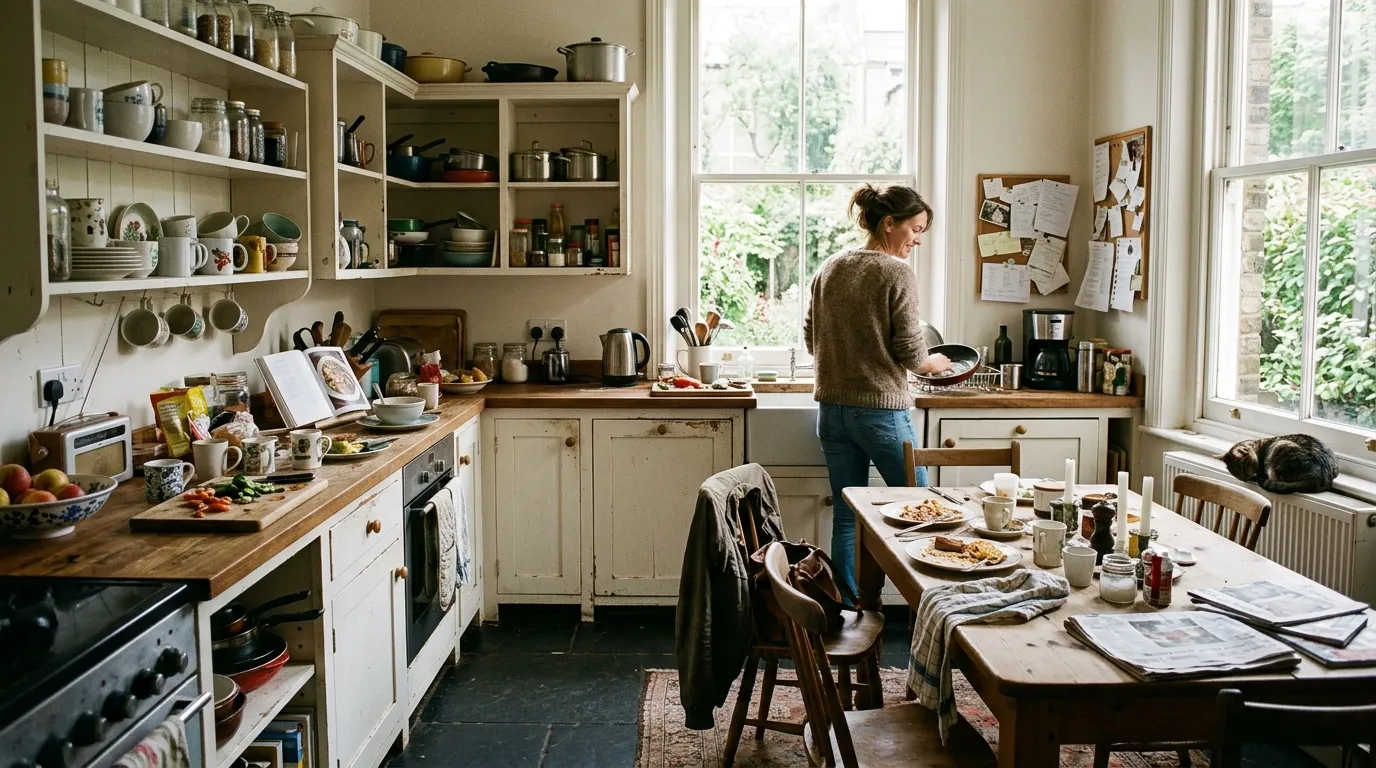
Open shelving in kitchens is among the most enduring divergences between photographed beauty and lived experience. The styled open shelf—specific objects at specific heights, curated by category or color—looks precisely right in an editorial image and requires constant maintenance to stay anywhere near that state in a functioning kitchen. The person who styled that photo left. You have to continue living there.
High-contrast color on primary surfaces—a dark, dramatic paint color on all four walls of a room, or a bold tile that covers significant floor area—produces a visual impact that earns engagement in a photo and can produce a low-grade intensity that becomes tiring over months of daily exposure. Not always. High-contrast color done well can be exactly right. But the version that photographs most dramatically is often the version calibrated for impact rather than for the experience of being in the room for the length of a normal evening.
The Specific Trends Most Likely to Disappoint
Japandi and related spare, hard-surface aesthetics photograph exquisitely and live well for people whose natural tidiness and possession count aligns with the aesthetic. They live badly for everyone else—which is most people. The aesthetic requires a level of ongoing curation that is, for many households, a second job on top of the primary job of actually living there. The gap between the photographed version and the inhabited version is not a styling failure; it's a fundamental tension between a visual philosophy optimized for absence and the physical reality of a life with belongings in it.
Linen everything. Natural linen is genuinely beautiful in soft light and genuinely creased within ten minutes of being touched. For people who are comfortable with that, it's an honest material. For people who bought into it expecting the look in the photo, the ongoing wrinkle management is a surprise the content didn't prepare them for.
Or rather: linen's wrinkling isn't the problem. The problem is that it's a defining visual property of the material, and almost no home content shows it. The photograph selects for the linen right after ironing, and the buyer's life occurs primarily in the other 98% of the fabric's existence. This is a relatively small issue for linen pillowcases; it's less small for a linen sofa covering in a household with regular use.
The highest-stakes version of this gap: kitchen and bathroom tile choices that look dramatic in the showroom and the photo, and that are grout-maintenance intensive in a way that only becomes clear after installation. Dark grout mitigates the visual issue but requires its own maintenance regime. Light grout in a heavily used kitchen or shower requires either a cleaning schedule or tolerance for grout that doesn't look like the photo within a few months.
How to Evaluate a Trend Before Committing
The most useful evaluation is temporal: what does this look like in the photo, and what does it require to maintain that appearance? If the maintenance is significant and you're not the kind of person who does that maintenance, the gap between the photo and your reality will be permanent. That's fine if you know it going in. It's a pain if you discover it after installation.
For reversible choices—paint, textiles, small furniture—the trend risk is low. Buy it, live with it, change it if it's wrong. For irreversible or high-cost choices—tile, flooring, built-in shelving, large upholstered pieces—apply a lived-reality test rather than a visual test. Visit the trend in the home of someone who has had it for two years rather than two months. The two-year home tells you what the renovation looks like after the photograph has been taken and the novelty has faded. The two-month home is still a photo waiting to happen.